A finished painting can hold more than one Instagram post. The full view shows the composition; a close-up might reveal a scraped edge or a color that disappears on a small screen. A room view gives it another context.
The image size should give those details enough space. For a portrait post, 1080 × 1440 px is a useful starting point where 3:4 is supported; square images and 4:5 crops also have their place. The best choice depends on what you want people to see.
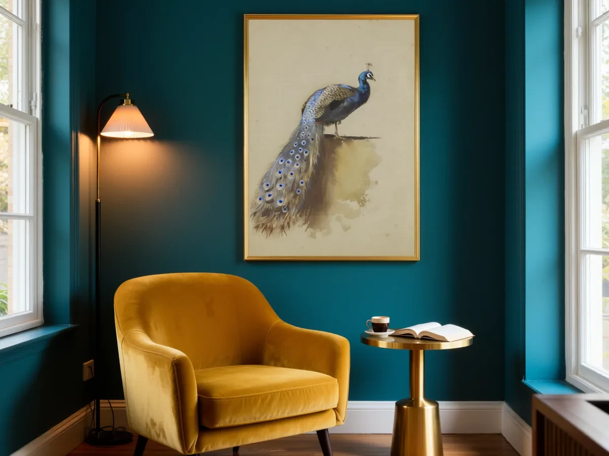 Frameit AI Create
Original artwork: Archibald Thorburn
Turn one painting into a story people can follow
Take a painting of a kitchen table. You could post five similar room images, or use the work to give viewers five different things to notice.
| Image | What it adds | A caption starting point |
|---|---|---|
| Complete artwork | An immediate view of the composition | “The blue cup was the last thing I painted.” |
| One close detail | A mark viewers missed in the full view | “I scraped this edge back to let the first layer show.” |
| A sketch or earlier stage | A decision made during the work | “The empty chair stayed; the flowers came out.” |
| A framed room preview | A sense of how the finished piece could live in a space | “Trying a warm wood frame for this one.” |
| Actual work with dimensions | Clear information for someone considering it | “Original oil on panel, 12 × 16 inches, available unframed.” |
These are illustrative prompts; use details that are true of your own work. Put the strongest complete image first and follow it with something that rewards a closer look.
End with one specific invitation. “Which frame brings out the blue?” gives people a concrete choice. A sales post can simply say where to see the dimensions, price and availability.
Choose the sequence, then its dimensions
Once you have the full view, detail and process images, give them a consistent canvas. These are useful export sizes; check the crop preview in the app before posting:
| Use | Ratio | Size to export |
|---|---|---|
| Portrait post where the publishing tool supports it | 3:4 | 1080 × 1440 px |
| Portrait post | 4:5 | 1080 × 1350 px |
| Square post | 1:1 | 1080 × 1080 px |
| Landscape post | 1.91:1 | 1080 × 566 px |
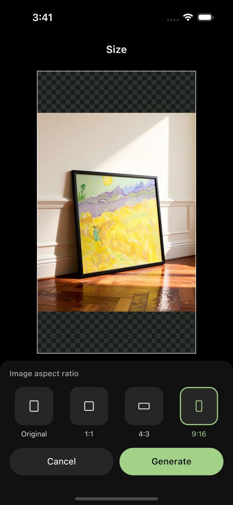
| Canvas for a Story or vertical Reel | 9:16 | 1080 × 1920 px |
A consistent canvas helps a carousel feel connected. The artwork does not need to fill every slide: leave a border around the complete view and move closer for the detail. Instagram’s photo-resolution guidance explains how uploaded photos are handled.
Which size fits your artwork
Portrait artwork. Try a 3:4 canvas first. A 3:4 artwork, like an 18 × 24 in canvas, fills the frame exactly. A taller 2:3 artwork, like a 24 × 36 in print, fits the 1440 px height at 960 px wide, which leaves a 60 px margin on each side. Place it on a plain background or wall rather than cropping the artwork itself.
Square artwork. Use 1:1 at 1080 × 1080 px. If you want more space in the feed, put the square artwork on a 3:4 background with room above and below.
Landscape artwork. A wide post takes up little height on a phone screen. Instead of a 1.91:1 post, show the artwork framed on a wall in a 3:4 or square image, and add a close-up crop as the second slide.
Series and details. Use a carousel: the full artwork first, then details. Since one orientation applies to every slide, export all slides at the same size.
Profile grid. Depending on a post’s shape, the profile grid can show a trimmed preview. Keep the artwork centered with some space around it, so nothing important sits at the edges.
The file should survive a closer look
A clean photograph or scan makes the biggest difference to the finished post. High-quality JPG in sRGB is a practical starting point, with a 1080-pixel width for the formats above. It is worth choosing the crop yourself, especially when a signature sits near an edge.
The feed and the profile grid may show different crops. A little space around the artwork gives you room to accommodate them. Small text inside the image is easy to lose; a caption can carry the dimensions or a short story without covering the painting.
A room view gives the painting another side
A “black frame or wood?” comparison gives people something specific to look at. In Frameit AI Studio, you can try both on a room result and keep the composition similar enough for the frame to be the visible difference.
The same result can also become a taller composition in Size. A 9:16 version is useful for a Story, while a square version may sit better beside other work in the feed. Changing the shape and checking the saved pixel dimensions are separate parts of preparing the image.
One room preview is often enough in a short sequence. The other images can show the actual painting, a close detail and an earlier stage. That gives the viewer several ways into the same work.
 Frameit Editor