A print shop may offer the same image on smooth photo paper and textured fine art paper. Both can look good, but they can make a pale watercolor or a dense ink drawing feel quite different.
“Giclée” generally refers to fine art inkjet printing, commonly using pigment inks and fine art paper. The word is useful background. The paper sample and a proof of your own artwork are where the decision becomes much clearer.
 Frameit AI Create
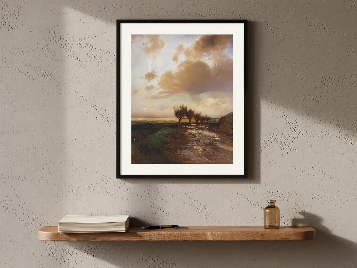
Original artwork: Alexei Savrasov
What giclée means
The word comes from the French verb gicler, “to spray” or “to squirt”, a nod to how an inkjet printer works. It was coined around 1990 for fine art prints made on early high-resolution inkjet printers, to set them apart from ordinary commercial proofs.
Today, giclée means fine art inkjet printing in general. There is no legal or industry-wide standard behind the word, so any print shop can use it. In practice, a print sold as giclée usually has these characteristics:
- Inkjet printing with pigment-based inks. Pigment inks are generally preferred for fine art because they resist fading better than dye-based inks.
- More ink colors than a basic office printer. Extra light and gray inks help reproduce smooth gradients and subtle tones.
- Archival media. Acid-free paper, often cotton rag or alpha-cellulose, or fine art canvas.
- A high-resolution file and color-managed workflow. The print is only as good as the scan or photo and the color matching behind it.
- Often sold as a limited edition. Signed and numbered, though open editions are common too.
Because the word isn’t regulated, ask what ink and paper are actually used rather than relying on the label alone.
Compare the surface your artwork needs
“Photo print” covers several processes and papers, while fine art inkjet printing can also be used for photography. There is overlap, so compare specific products.
| What matters in your artwork | What to ask the printer to show you |
|---|---|
| Pale watercolor washes | A sample that holds very light tones without losing them in the paper texture |
| Fine ink lines | Sharp lines and clean edges on the proposed paper |
| Deep blacks and subtle dark tones | A proof showing whether neighboring dark areas remain distinct |
| The feel of the original paper | Smooth and textured paper samples at the same image size |
| A glossy photographic look | Gloss or luster options and how reflections affect the image |
For example, a heavily textured sheet might complement one watercolor but make a very fine drawing harder to read. Print the same detail on two candidate papers and compare under the light where the work will be viewed.
If longevity matters, ask for published testing for the actual ink-and-paper combination and its display conditions. A name or a paper-weight number alone cannot establish how a finished print will age.
Giclée vs other art prints
Buyers also compare giclée with other print types they see in shops:
| Print type | How it’s made | What to know |
|---|---|---|
| Giclée | Inkjet with pigment inks on fine art paper or canvas | Made one at a time, so small editions are practical |
| Offset lithograph (poster) | Ink transferred from printing plates | Economical for large runs; a magnifier shows a regular dot pattern |
| Screen print | Ink pushed through a mesh stencil, one color at a time | Each color is a separate layer; usually seen as an original printmaking medium |
| Canvas print | Any printing method on canvas | Canvas is the surface, not the method; a canvas giclée is a giclée on canvas |
A useful conversation with the printer
“Which paper is this, and can I see my image on it?” is a useful place to begin. The paper name, weight and surface give you something concrete to compare. The ink system and a proof help explain how that combination will handle your work.
If longevity is part of what you plan to sell, ask for published information about the actual ink-and-paper combination and the conditions behind any lifespan claim. A paper described as archival does not tell the whole story of the finished print.
Handling matters too. Fine art paper can scuff or crease, so it is worth seeing how the print will be protected. Once the materials and finish are settled, the listing can describe them plainly, alongside the print size, border and edition details.
Describe the paper and ink people are buying
“Pigment-ink print on 300 gsm matte cotton paper, 8 × 10 inches, unframed” gives someone a concrete idea of the item. This is an illustrative description; use the materials your printer has confirmed.
Add an angled photograph that shows the surface and a complete front view. Someone who prefers a smooth finish may choose differently from someone who likes visible paper grain. Showing that distinction is more useful than relying on “museum quality.”