Black, oak and gold can all work around the same painting, for different reasons. Black may pick up an ink line. Oak may sit comfortably beside warm paper. A muted gold can echo a little ochre in the image.
That gives you a more useful starting point than matching the frame to the sofa. Find something in the artwork you want to bring forward, then see which frame does that without taking over.
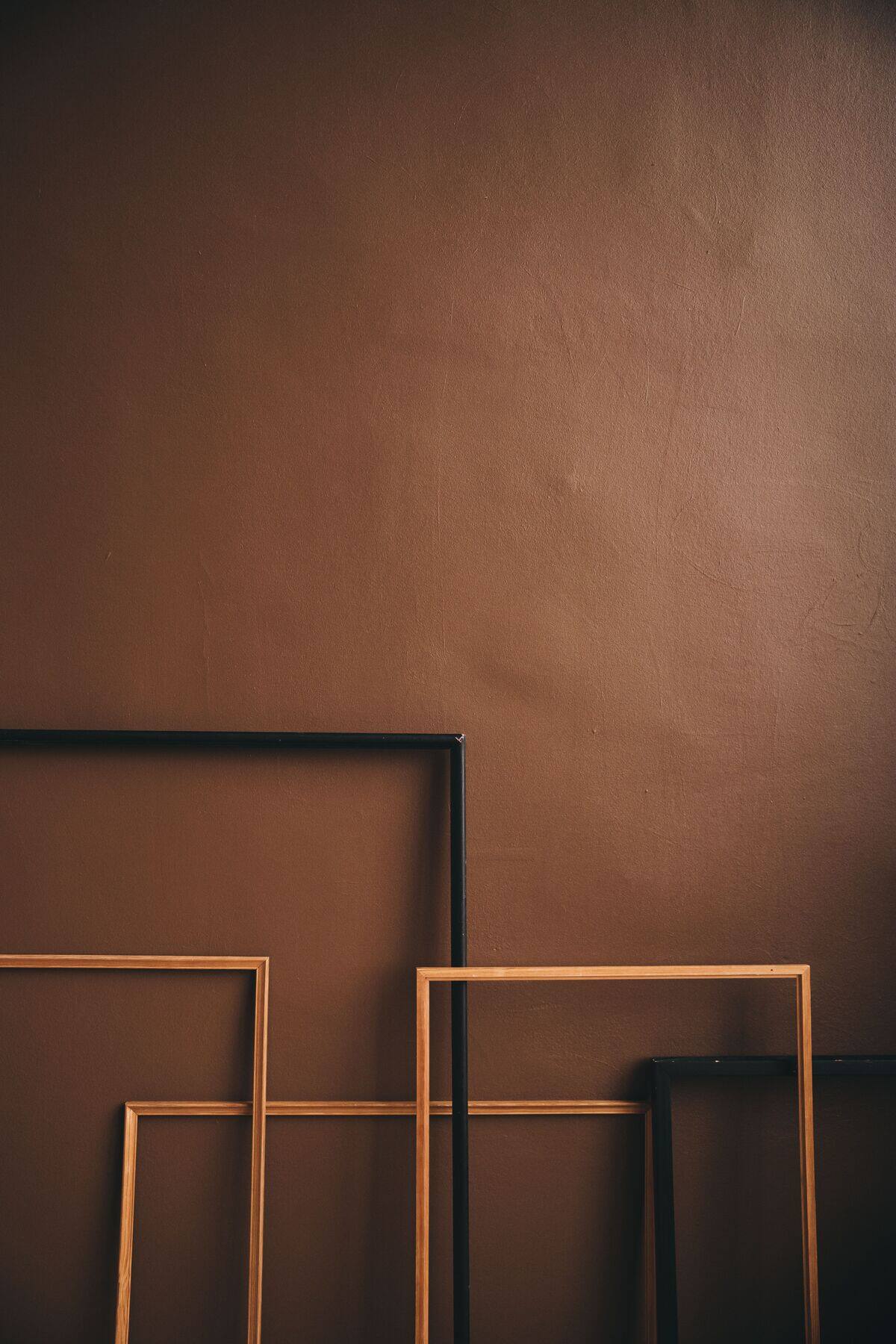 Photo: Lisett Kruusimäe / Pexels
Black and warm wood against the same wall. Compare the color and shape of the frame edges, then test your artwork inside the shortlisted frames. Photo: Lisett Kruusimäe · Pexels License.
Measure the artwork and decide on a mat
Measure the width and height of the image, and of the paper if it has a margin. Then decide whether the piece needs a mat:
- Works on paper (prints, drawings, watercolors, photos) usually look better with a mat, and the mat keeps the surface off the glass.
- Paintings on stretched canvas usually go straight into the frame with no mat and no glass.
Start with the visible image plus the mat borders, then confirm how much the window will overlap the paper. For example, an 11 × 14 inch visible image with 2.5-inch side borders and 3-inch top and bottom borders needs a 16 × 20 inch outer mat. That is still smaller than the finished frame’s outside dimensions. Our chart of standard picture frame sizes lists the common pairings, and the mat width guide covers border sizes.
Match the frame style to the artwork
The frame should feel like it belongs to the artwork. This table is a starting point, not a rulebook:
| Artwork | Frames that usually suit it | Mat and glazing |
|---|---|---|
| Oil or acrylic on stretched canvas | Floater frame, plain wood, or gilded moulding deep enough for the stretcher bars | Usually neither |
| Watercolor, drawing, pastel | Slim wood or metal | Wide off-white mat, glass or acrylic |
| Black-and-white photography | Thin black, white or silver | Bright white mat |
| Color photography and digital art | Thin black, white or natural wood | Mat optional |
| Traditional or classical painting | Ornate wood or gold | Usually no mat |
| Posters and large prints | Slim black, white, wood or metal | Often no mat |
Contrast can also work on purpose, such as a heavy gold frame around a simple modern print. If you try it, keep the rest plain so the pairing looks intended.
What draws your eye in these two frames
In these Frameit AI Create examples, the black frame gives the yellow painting a distinct boundary. The gold frame and white mat introduce more space around the image, along with a decorative edge.
| Black frame | Gold frame with a white mat |
|---|---|
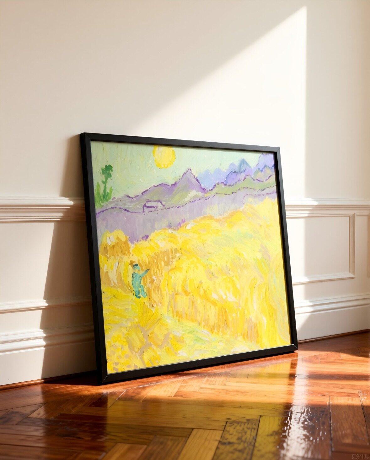 Frameit AI Create |
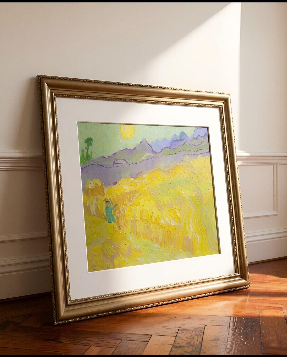 Frameit AI Create |
Original artwork: Vincent van Gogh · Wheatfield with a Reaper · Van Gogh Museum
Notice where you look first. The black frame is a direction to explore if you like a compact, defined outline. The white mat is worth trying if you want more space around the painting. The gold ornament also becomes part of the presentation; some works need less activity at the edge.
Composition and small details vary between these generated images, so use them to compare styling directions. To judge the frame color on its own, keep the artwork, size and background fixed in a regular framing preview, then change the frame. Compare real material samples beside the original before choosing a physical frame.
A wider frame has more to say
A broad moulding can hold its own beside a dense, colorful painting. Around a fine pencil drawing, the same profile might feel like the loudest part of the picture. Width is easier to judge with the artwork inside the frame than from a corner sample alone.
The mat changes that relationship too. A slim frame and a generous mat can give a drawing some quiet space; a narrow mat beside a heavy frame may feel crowded. Those are reasons to compare, rather than rules that every picture has to follow.
For canvas, depth also matters. A frame needs to accommodate the stretcher bars; a floater frame leaves a visible gap around the canvas and shows its edges.
Choose glazing and backing
- Glass or acrylic. Glass resists scratches and looks very clear. Acrylic is lighter and more shatter-resistant, which suits large frames, children’s rooms and anything you will ship.
- UV-filtering glazing helps protect originals and pieces hanging near a sunny window.
- Anti-reflective glazing helps in bright rooms or opposite a window, where glare would hide the artwork.
- Acid-free mats and backing are worth it for originals, signed prints and photos you want to keep.
Canvas paintings are usually left unglazed, so this step mostly applies to works on paper.
 Photo: Blue Bird / Pexels
Look behind the frame: check the removable backing and retaining tabs as well as the front finish. Ask the supplier about the backing material; its color cannot tell you whether it is acid-free. Photo: Blue Bird · Pexels License.
It helps to see the whole frame
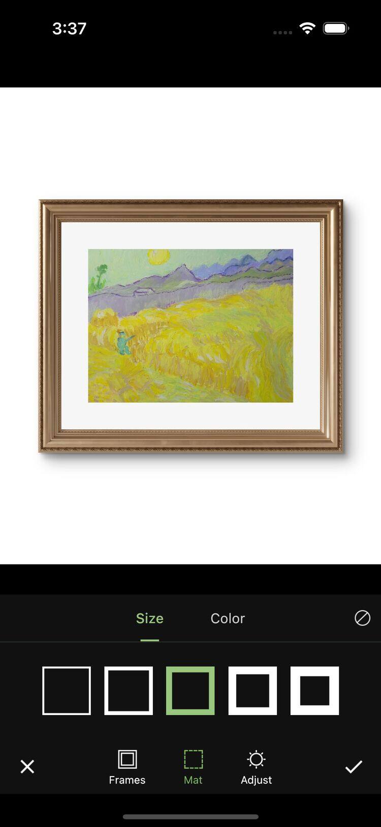
Frame samples in a shop show you the finish, but only a small part of the eventual border. Trying the whole artwork in Frameit AI Studio can help narrow down what you want to look for.
On a generated room image, Frame lets you change the frame and mat. A black version beside a wood version is often a more useful comparison than ten finishes viewed one after another. The artwork and room should stay similar enough that you can tell what the frame changes.
A saved preview gives you something concrete to discuss with the framer: this amount of space, this sort of warmth, this lightness of edge. The real materials and final measurements come next.
 Frameit Editor